library(tidyverse)
library(cluster) # For Silhouette Method
library(broom)
library(plotly) # For Interactive Visualization
theme_set(theme_light()) # Set default theme

rstats <- read_csv("rstats_reduced.csv")Introduction
Motivated by #tidytuesday, I will be working with the entire trove of #rstats tweets from its inception on September 7th, 2008 to the most recent one on December 12th, 2018.
This tweet inspired me to use K-Means Clustering, an unsupervised learning method I know a little about, but would like to learn more. I grouped twitter accounts by popularity measure, a quick and easy way (I came up with it) to quantify the popularity of a Twitter account:
Popularity Measure = Likes + Rewteets + Number of Followers
Analysis
To start off, I filtered only for #rstats tweets in 2018, tweets by accounts with more than 400 followers, and selected the following columns: screen_name, favorite_count(Likes), retweet_count, followers_count. Hence, I have rstats_reduced.csv
First, I load packages and import my dataset:
For the rest of this article, I follow a clear tutorial in the UC Business Analytics R Programming Guide by Bradley Boehmke.
- Make rows as observations and columns as variables
# Find the mean of Likes and Retweets
rstats_clustering <- rstats %>%
  group_by(screen_name) %>%
  mutate(favorite_count_avg = mean(favorite_count),
         retweet_count_avg = mean(retweet_count)) %>%
  filter(row_number() == 1) %>%
  select(screen_name, followers_count, favorite_count_avg, retweet_count_avg) %>%
filter(favorite_count_avg <= 20, retweet_count_avg <= 20)- Check for missing values
None of these columns have NA values, so I don’t need to worry about removing or estimating missing values.
- Scaling the data (
scaleturns our dataset into a matrix)
rstats_clustering <- rstats_clustering %>%
  as_data_frame() %>%
  remove_rownames() %>%
  column_to_rownames(var = "screen_name") %>%
  scale()
Now, I am done with data preparation and are ready to run the K-Means Algorithm… Not so fast. I need to determine the optimal number of clusters beforehand.
Elbow & Silhouette Method (Code borrowed from DataCamp class: “Cluster Analysis in R”)
# Set seed
set.seed(42)

# Use map_dbl to run many models with varying value of k (centers)
rstats_tot_withinss <- map_dbl(1:10,  function(k){
  rstats_kmeans <- kmeans(rstats_clustering, centers = k)
  rstats_kmeans$tot.withinss
})

# Generate a data frame containing both k and tot_withinss
elbow_df <- data.frame(
  k = 1:10 ,
  tot_withinss = rstats_tot_withinss
)

# Plot elbow plot
ggplot(elbow_df, aes(x = k, y = tot_withinss)) +
  geom_line() +
  scale_x_continuous(breaks = 1:10) +
  labs(x = "K",
       y = "Total within-cluster sum of squares") +
  ggtitle("Elbow Method",
          subtitle = "Since there is no definite elbow, let's use Silhouette Method")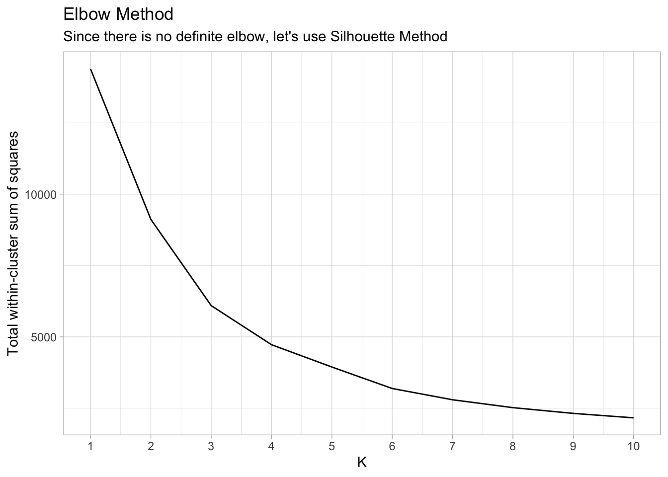
Silhouette Method
# Use map_dbl to run many models with varying value of k (centers)
sil_width <- map_dbl(2:10,  function(k){
  rstats_clustering_model <- pam(x = rstats_clustering, k = k)
  rstats_clustering_model$silinfo$avg.width
})

sil_df <- data.frame(
  k = 2:10,
  sil_width = sil_width
)

ggplot(sil_df, aes(x = k, y = sil_width)) +
  geom_line() +
  scale_x_continuous(breaks = 2:10) +
  labs(x = "K",
       y = "Average Silhouette Widths") +
  ggtitle("Optimal Number of Clusters",
          subtitle = "K = 2 has the highest Silhouette Score")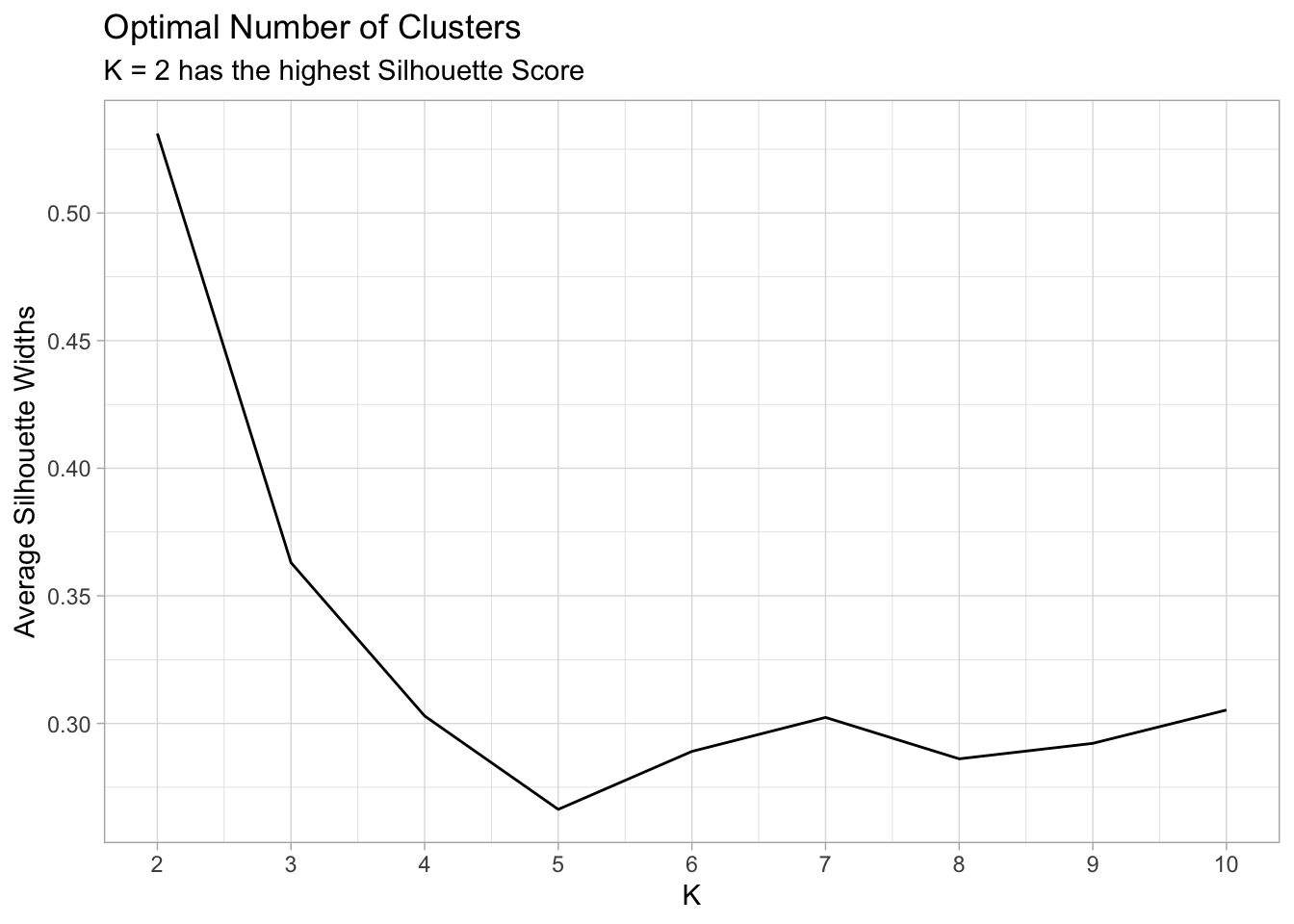
Finally, let’s run the K-Means Algorithm with K = 2.
rstats_clustering_kmeans <- kmeans(rstats_clustering,
                                   centers = 2,
                                   nstart = 25)
Now let’s visualize our clustering analysis using a scatterplot of Retweets vs Likes with points colored by cluster. The plotly package allows users to hover over each point and view the underlying data. Let’s show the Twitter handle, average likes, average retweets and cluster assignments in this plotly graph.
clustering_plot <- rstats_clustering %>%
  as_tibble() %>%
  mutate(cluster = rstats_clustering_kmeans$cluster,
         screen_name = rownames(rstats_clustering)) %>%
  ggplot(aes(x = favorite_count_avg,
             y = retweet_count_avg,
             color = factor(cluster),
             text = paste('Twitter Handle: ', screen_name,
                  '<br>Average Likes:', round(favorite_count_avg, 1),
                  '<br>Average Retweets:', round(retweet_count_avg, 1),
                  '<br>Cluster:', cluster))) +
  geom_point(alpha = 0.3) +
  labs(x = "Average Likes",
       y = "Average Retweets",
       color = "Cluster"
       ) +
  ggtitle("K-Means (K=2) Clustering of Twitter Screen Names")

ggplotly(clustering_plot, tooltip = "text")
Conclusion
In this article, I imported the #rstats tweets dataset, prepared it for cluster analysis, determined the optimal number of clusters, and visualized those clusters with plotly. The interactive graph clearly shows two distinct clusters of twitter accounts according to average retweets, average likes, and number of followers.
Even though the K-Means algorithm isn’t a perfect algorithm, it can be very useful for exploratory data analysis. It divides twitter accounts into two groups according to my “popularity measure” and allows for further analysis one group (Cluster 1 or Cluster 2) at a time.
Thank you for reading!